My Role: Project
Manager & Design Lead
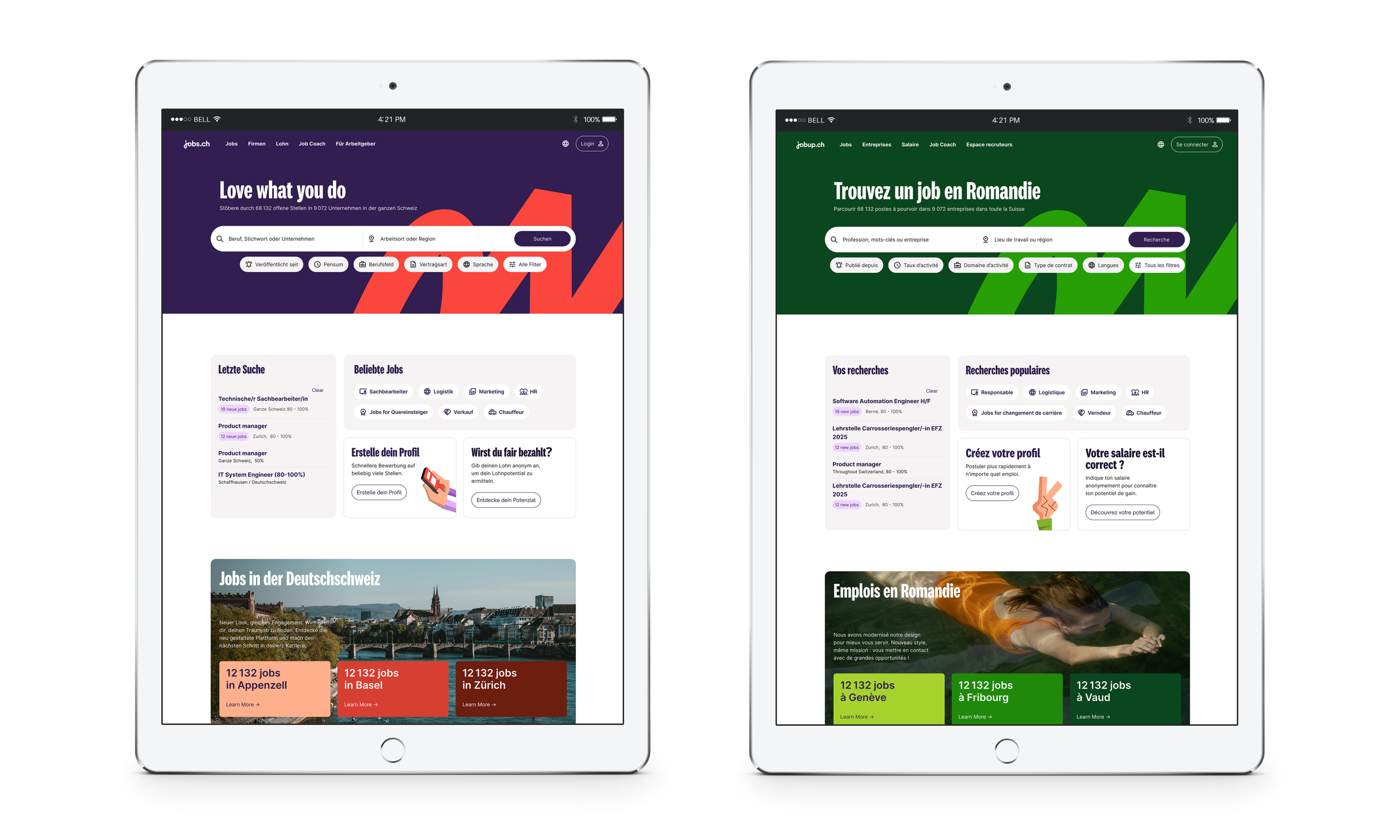
Client: JobCloud is a platform that offers a range of digital recruitment solutions. It’s portfolio includes renowned job portals such as Jobs.ch and Jobup.
Reimagining two brands for a new generation of job seekers
After more than 25 years as Switzerland's leading job platforms, jobs.ch and jobup.ch faced a growing challenge: staying relevant to a workforce with new expectations around job flexibility and prioritization of work-life balance.
While both brands were highly trusted and recognized, research revealed an identity that felt professional yet impersonal, lacking the distinctiveness and clear brand values that emotionally resonated with today’s job seekers.
Rather than approaching the project as a visual refresh, we saw it as an opportunity to redefine how the brands connect with people. The strategy focused on creating a bold and distinctive identity rooted in Swiss heritage, while introducing a more joyful, aspirational, and human perspective on work through our visual language. A unified colour architecture strengthens the relationship between jobs.ch and jobup.ch while preserving their local character and market distinction.
Our Strategy:
*
Our Strategy: *
At the heart of the new identity is the Life Path, a flexible visual principle that reflects the non-linear journeys people take throughout their careers. Expressed through the logo, typography, illustrations, and motion, the system celebrates growth, change, and individuality.
Visual World
*
Visual World *
People sit at the centre of the new brand. Authentic photography portrays real moments that balance work and life, reflecting the diversity, aspirations, and realities of modern job seekers. The result is a more distinctive and emotionally engaging brand experience. One that reflects not only how people find jobs today, but how they want to balance their professional and personal lives.
User Testing & Results
.
User Testing & Results .
Launched in February 2026 across all jobs.ch and jobup.ch platforms, the new identity was tested with participants across Switzerland's German- and French-speaking regions, where it was well received across all target groups, and perceived as more distinctive than competing job platforms.
• Brand colors resonated strongly with our values;
• The redesign was well received across all target groups;
• 72% found the design more distinctive than competitors